Cancer Council Victoria by One Design Office | Photographer: Dave Kulesza
Cancer Council Victoria by One Design Office | Photographer: Dave Kulesza
Cancer Council Victoria by One Design Office | Photographer: Dave Kulesza
Cancer Council Victoria by One Design Office | Photographer: Dave Kulesza
Cancer Council Victoria by One Design Office | Photographer: Dave Kulesza
Cancer Council Victoria by One Design Office | Photographer: Dave Kulesza
Cancer Council Victoria by One Design Office | Photographer: Dave Kulesza

Cancer Council Victoria by One Design Office | Photographer: Dave Kulesza
Cancer Council Victoria by One Design Office | Photographer: Dave Kulesza
Cancer Council Victoria by One Design Office | Photographer: Dave Kulesza
Cancer Council Victoria by One Design Office | Photographer: Dave Kulesza
Cancer Council Victoria by ODO
Since its inception in 2014, ODO has continued to grow stronger. Their approach focuses on creating meaningful and lasting designs that connect people through thoughtful architecture and interiors. We spoke to the team about their award winning Cancer Council Victoria project.
What inspired the design concept of the project? Were there any specific architectural movements, cultural influences, or historical references that played a significant role in shaping the aesthetic and spatial arrangements?
Cancer Council Victoria's design was conceived as a dynamic space fostering innovation, collaboration, and well-being. It prioritises supporting researchers and staff by meeting their diverse needs and working requirements, promoting productivity, collaboration and creativity.
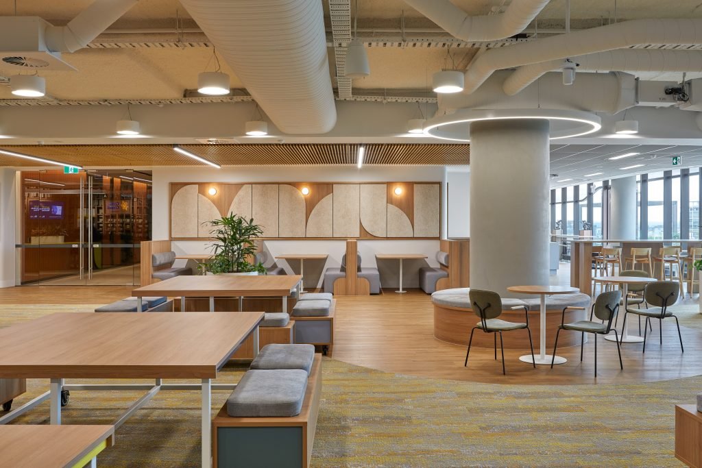
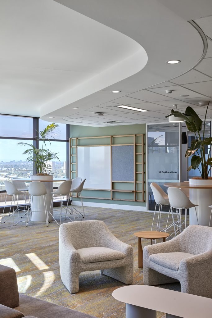
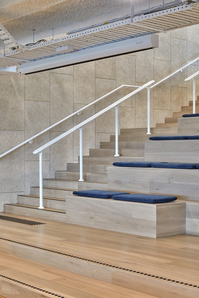
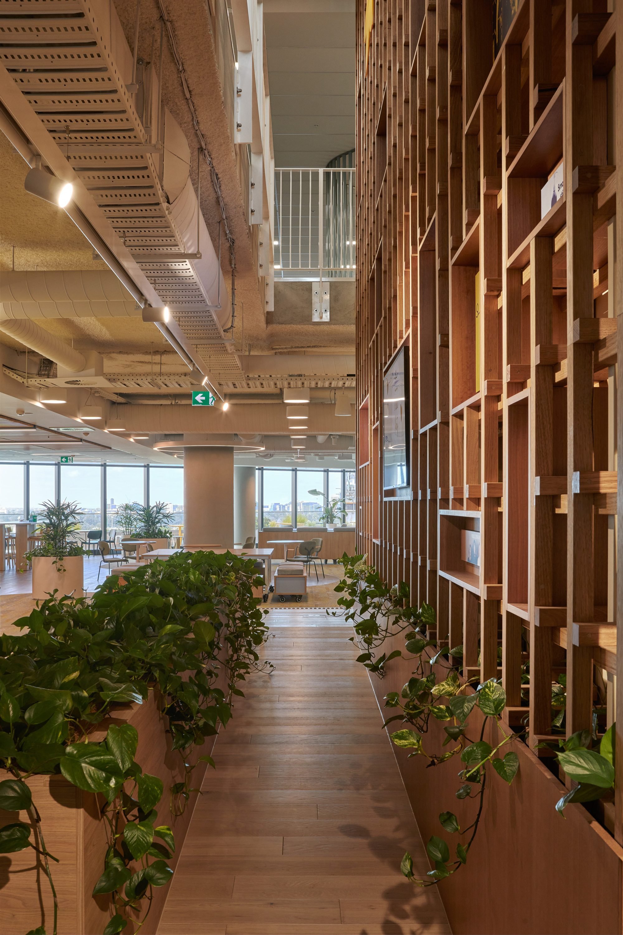
As we transition into a post-pandemic era, the design aims to strengthen the organisation's sense of purpose and community. Spanning 2 floors over 4300 sqm, a visually engaging social spine conjoins separate work "neighbourhoods" together within the office, allowing a large office to feel small. By incorporating formal and informal work areas, along with breakout sections for socializing and relaxation, these work boroughs bring a sense of intimacy and warmth into the work environment.
Were there any new materials or techniques you explored in this project?
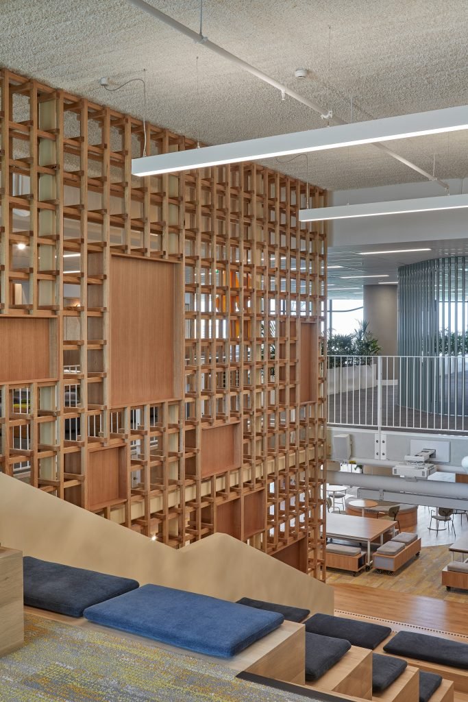
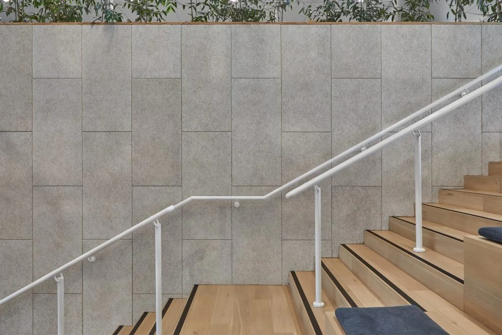
While we have incorporated wood wool in our projects before, its role in this project is much more celebrated. Infusing tactile warmth into the workspace, wood wool emerges as a defining feature, not only providing acoustic treatment but also exuding the earthy scents of nature. This sustainable material serves as a testament to Cancer Council Victoria’s commitment to sensory comfort and environmental stewardship.
What is next for ODO?
We’ve just celebrated 10 years of ODO! We’re looking forward to the completion of several projects we’ve been working on over the past few years, such as Seafarers Melbourne and Monash Accommodation, and we’re also excited about the many projects we have in the pipeline.
Tell us about your and your team’s experience engaging with the content on Built Environment Channel screens.
As we have our screen located in our communal dining area and materials library, quite often we will notice new and inspiring projects, or different fittings and materials that show up on the screen. These discoveries become great discussion topics that contribute to the overall design process of the team.
Can you elaborate on how the design prioritises human-scale experiences? How does the architectural layout and detailing enhance user comfort, navigation, and overall interaction within the space?
Through vibrant colour schemes and dynamic elements along the central social spine, the design subverts the notion of a static workspace, promoting adaptability and flexibility. It redefines the office landscape, prioritizing user experience and responsiveness to individual needs. Overall, it showcases the importance of holistic design solutions that prioritize people and purpose.
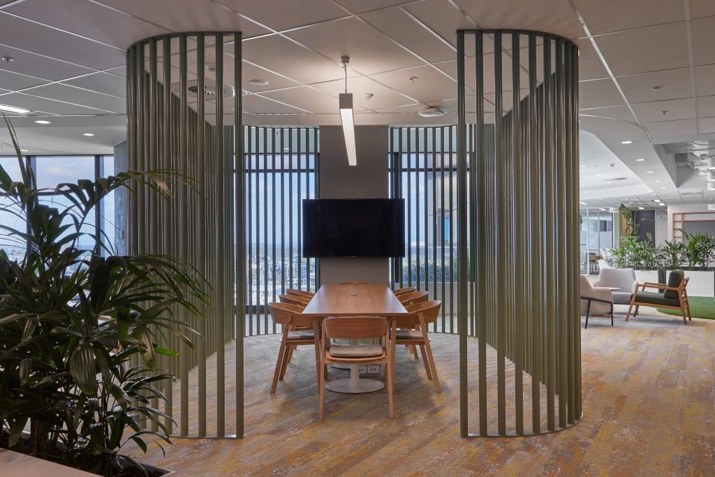
At the fine grain, the use of boroughs or "neighbourhoods" within the floor plates, optimises spatial usage and team clustering. Doing this allows us to present a workplace in at a human scale, encouraging familiarity, intimacy and warmth. By breaking down traditional barriers and zones for workplaces, the new layout offers a diverse array of work points and spaces, empowering employees with choice over their work setting.
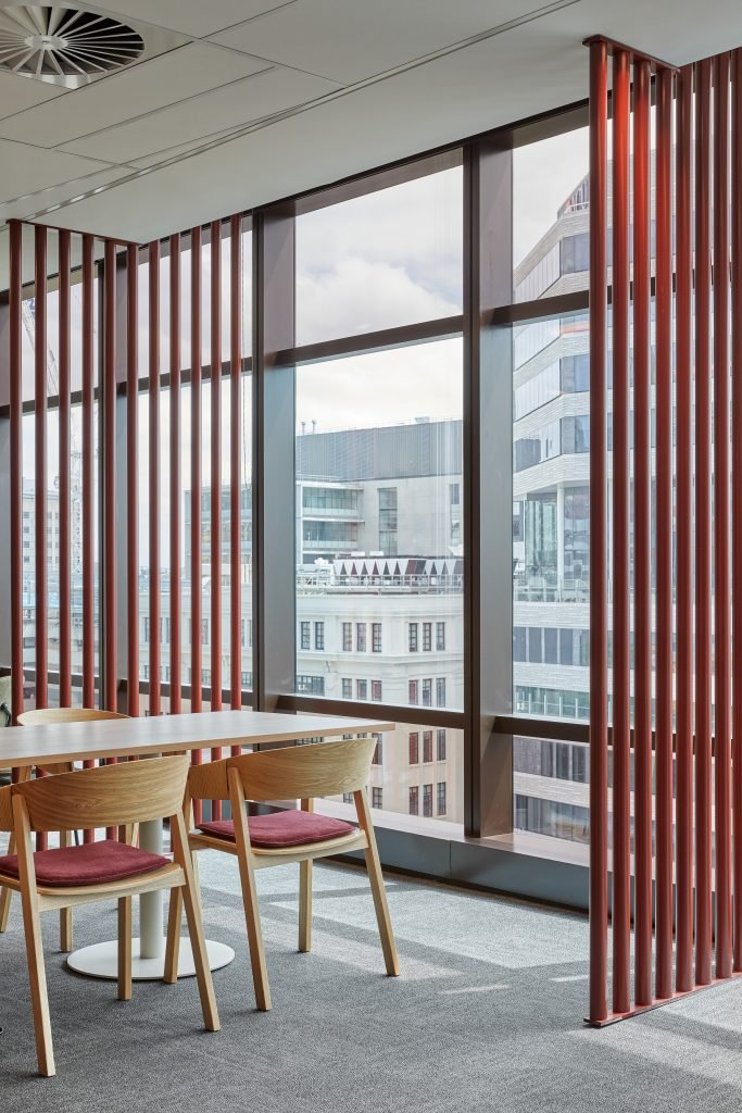
Each "neighbourhood" is distinguished by vibrant pops of colour, enhancing visual appeal and aiding wayfinding. Natural materials and biophilic elements further contribute to the well-being and comfort of over 400 occupants.
Could you discuss the sustainable features integrated into the design, such as energy-efficient systems, use of eco-friendly materials, or strategies for minimising environmental impact throughout the building's lifecycle?
Biophilia was one of the key design strategies that we wanted to implement into the project. The workspace unfolds as a lush sanctuary, teeming with greenery that permeates both public spaces and private work zones. Vines cascade down central staircases, while carefully curated plant life adorns workstations, seamlessly blending the indoors with the outdoors, fostering a rejuvenating ambiance.
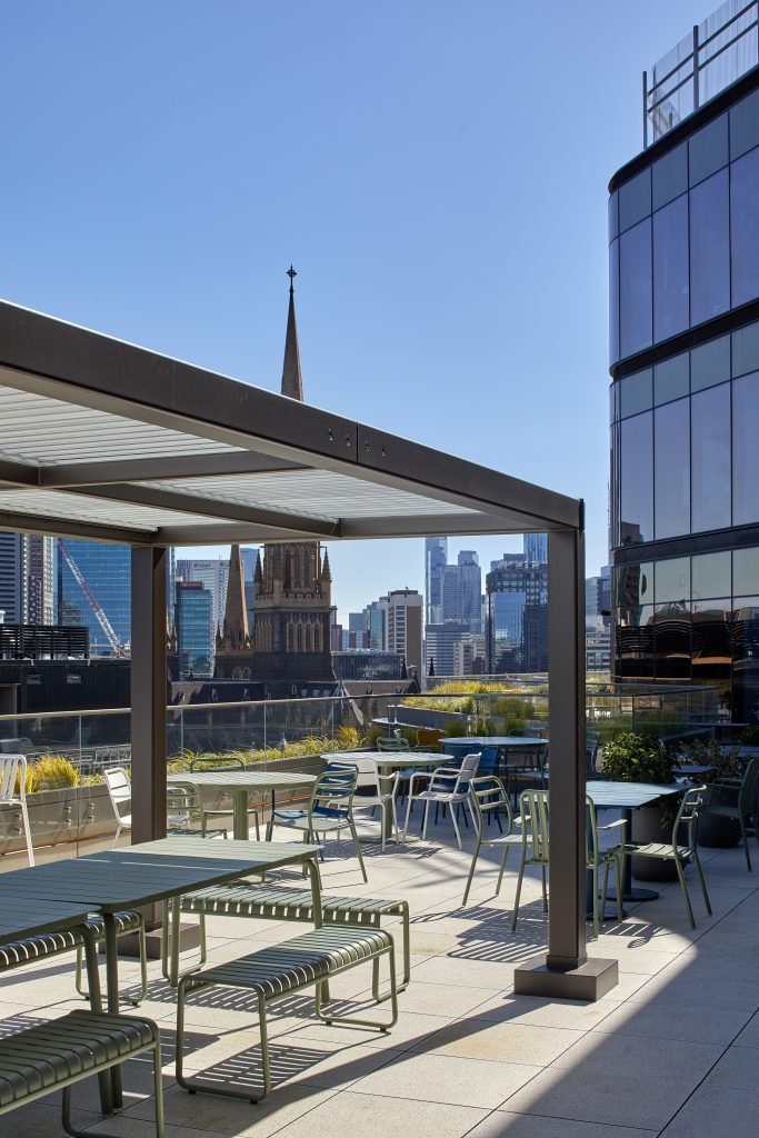
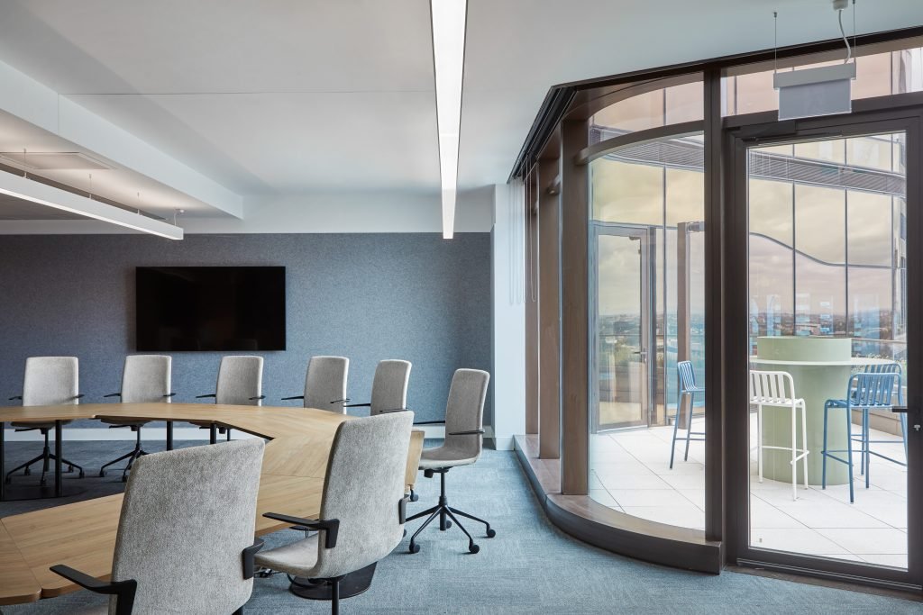
The design brief of Cancer Council Victoria had strong desires for connection to country. We extrapolated upon this desire by preserving views towards the Yarra River, using locally sourced timbers, endemic to the location of the site and introducing native greenery into the site.
The design respects the site's existing conditions, minimising demolition from the base building and the wastage of materials. Sustainable timber and certified wood are thoughtfully incorporated, underscoring the project's commitment to sustainability, and promoting awareness of sustainable practices. Further, the fit-out aligns with the building's sustainability targets of 6-Star Nabers, 6-Star Green Star and Well Gold Certification.
Collaboration often plays a crucial role in architectural projects. Could you share insights into how the ODO team approaches interdisciplinary collaboration, whether with engineers, landscape architects, or other professionals?
At ODO, we believe in integrating different perspectives into our projects, to ensure that they are not only designed meaningfully, but functionally sound as well. Collaborating closely with partners, we invite them into our iterative design process, often meeting up to discuss during the design development process to incorporate a range of ideas while maintaining alignment with project constraints and objectives. This approach allows us to ensure that each project resonates with both functionality and creativity.


